Mapping Financial Inclusion with FSP Maps and MIX FINclusionLab
As financial inclusion advances on many national agendas, policymakers, regulators, financial service providers and financial service users ask a range of critical questions – from the most fundamental: “How long does it take to reach the nearest financial service provider?" to the more complex: “What are the pillars of an enabling policy environment?” There is a distinct need for high-quality data and analysis tools to effectively answer these questions. The Maya Declaration, launched by the Alliance for Financial Inclusion (AFI) and supported by more than 50 countries, calls for national financial inclusion commitments in four areas, including utilizing data for informed policymaking and tracking of results.
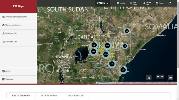
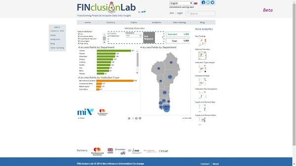
Both the Bill and Melinda Gates Foundation and MIX (Microfinance Information Exchange) have invested in creating platforms that make financial inclusion data publicly available through platforms designed to help a wide range of actors answer find answers to their questions. FSP Maps (financed by the Gates Foundation) and FINclusionLab (promoted by the MIX) utilize high-quality datasets on the location of financial service providers as well as demographic data to geospatially visualize financial access. Both data sources have a focus on sub-national data and are distinguished from other data sources by their visualization and analytical tools.
Why does sub-national matter?
Financial inclusion data sets (such as the World Bank’s Global Findex and the IMF’s Financial Access Survey) are critical for a range of analyses, especially benchmarking progress at the national level with other countries. At the same time, understanding financial inclusion within a country requires greater granularity. Financial access does not distribute uniformly within national boundaries so national “averages” can be misleading. In order to understand the experience of financial inclusion at the regional, provincial, and local level, FSPMaps and FINclusionLab bring in data that allows us to compare and contrast financial inclusion within a country’s borders. This brings us closer to the reality of financial access for individuals, banked and unbanked, in the diverse contexts – rural, urban, well-communicated, remote, etc. – that exist in every country. In so doing, we are reminded of the importance of refocusing the larger debate from the national level, to the local.
Why physical access?
The fundamental importance of physical access is a barrier that is too-often overlooked; we rarely see updated, centralized and comprehensive (to the extent possible) information on the physical locations of financial services providers. Back in 2011, Ignacio Mas and Jake Kendall made a great point: “one can't cite any financial product that was so good that clients signed up in large numbers despite the inconvenience of having to travel very long distance.” One of the powerful advantages of mapping data at high-resolution, a focus of FSPMaps, is the representation of spatial and geographical relationships, a process that has been enabled by the development of new GPS receivers and GIS software and that provides evidence on the challenges of distance and attendant costs of transportation, time, etc.
How does “data visualization” help us design better policies, products and plans?
In order to best take advantage of the robust datasets provided by the platforms, FSP Maps and FINclusionLab employ cutting-edge analytic tools. Through “data visualization” -- tools, charts and maps -- they provide an interactive interface that allows users to analyze and extract valuable insights from large, multiple datasets. They offer dynamic views through dashboards, charts, maps and matrices, allowing users to customize their analyses to respond to their own financial inclusion questions. Users of both platforms -- financial service providers, government agencies, Central Banks and donors, among others – can perform quick and effective data analyses to support informed decisions as they work toward financial inclusion goals.
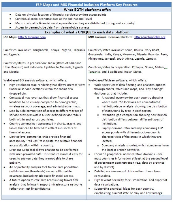
Both FSP Maps and FINclusionLab continue to grow and expand their available data. We look forward to your input and, most of all, to seeing how you use these tools to further our common goal of financial inclusion for all.
Do you have an example of how you used these or other financial inclusion data tools for original research? Tell us about it in the comments.



Comments
Hello: My name is Pedro
Hello: My name is Pedro Alvear. I was the Co-founder and General Manager of Globokas SAC, the first company that deployed an agnostic network of bank correspondent agents in Peru.
I would like to know if you have an FSP map for peru and if not, what steps should be followed to produce one.
Sincerely,
Pedro Alvear
Board Member
Globokas SAC
Globokas SAC
Hello Pedro, Thank you for
Hello Pedro, Thank you for your follow-up. We do have a Peru workbook in FINclusionLab: http://finclusionlab.org/country/Peru/analytics, and will be publishing a new blog post based on this data in the next couple of weeks. Thanks, Xavier
Estimado Xavier, muy
Estimado Xavier, muy interesante información, me gustaría saber si es posible acceder a las series estadísticas por distrito, para el caso de Perú. Gracias de antemano por la respuesta.
Hi
Hi
My name is Seema and a PhD student working on the linkage between Financial Inclusion and Social Protection. Is there any way through which I can export data from fspmaps into excel?
Thanks
Seema
Add new comment