The Power of Smartphone Interfaces for Mobile Money
A number of organizations have collaborated to bring out an initial set of 21 principles for the design of smartphone interfaces and mobile money. We hold that this is a powerful new area of research and testing that can harness the power of smartphones to better serve the poor.

It is true that smartphones are not accessible for many. Indeed, many poor people still do not use feature phones. Yet the forces pushing smartphones out into the hands of hundreds of millions of people are strong.
In Myanmar today nearly four in five connections are smartphones, and most are already using data to access the internet. Prices are at all-time lows – a few weeks ago I bought a new smartphone on the streets in Yangon for $28. India’s newest mobile network operator, Jio, is going straight to 4G and offering voice services for free, aiming to gain revenue from data sales. The world is rapidly urbanizing, putting many more people within reach of 3G and 4G cell towers. These forces are particularly powerful in Asia according to GSMA.
It is possible that in five years, more banking transactions will happen via a smartphone than by traditional banking channels. This may include many low-income people who would otherwise not access formal financial services.
A lot of hype speculates about how over-the-top (OTT) players like WeChat or Facebook will enter the space. This is important, but interface designs could have an even bigger impact. Today, older USSD or SIM toolkit hierarchical menu interfaces keep many users away. A simple cash-in transaction can require seven to eight menu screens and entering two to three number sequences. Mistakes are all too easy. It is too painful to use often or for everyday purposes. Many stay away altogether.
Smartphone interfaces not only have the chance to make basic transactions simpler, they can potentially address a host of other barriers. For instance, services can be presented more transparently, listing fees and costs as transactions happen. Videos or graphics can explain services and their risks more clearly than text only. Customers register for new services quickly – perhaps even self-registering without the costly need to fill in paper forms or visit a branch or agent.
Each of these changes are small, but collectively they are transformative. These changes can drop the cost of customer acquisition from $10-20 per customer to merely a few cents at a time. Ease of use can persuade users to transact more frequently. Building trust through transparency, providers can persuade customer to carry larger balances.
Imagine the changes for customers. Social media and contact lists can make easier links with business partners and families. Users can better self-protect with more information; more importantly, key information is presented in understandable and intuitive ways. Some customers should find the simplicity of the user interface a reason to switch from OTC to wallet-based transactions.
Unfortunately, the early use of smartphones has not leveraged the full capabilities of smartphones. New apps often mimic USSD hierarchical menus, over-rely on text or simply try to squeeze a laptop online interface onto a much smaller smartphone screen.
To take full advantage of the transformative potential we need to invest in interface design – often referred to as the user interface (UI) and user experience (UX). This is not a side activity delegated to one person in the marketing department. Interfaces are a strategic asset. Just look at how the largest and best known Silicon Valley firms invest: Expedia, Facebook, Uber. Each relentlessly tests and improves its interfaces. A recent report on #DesignInTech highlights the growing importance of design in technolgy.
It highlights some important facts:
- Design is leveraged over the entire user base. Investments, even in small tweaks, can have massive impacts on use and revenues.
- When the CEO cares about design, progress happens fast.
- Design is increasingly valued on equal footing with those who code/program. Many more positions in management are design focused.
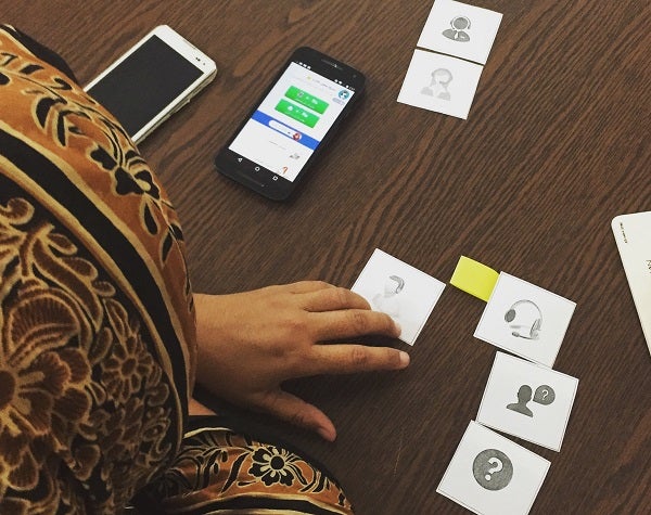
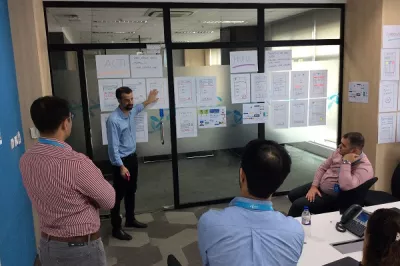
To put our hypotheses to test, CGAP and its partners Wave Money Myanmar, Karandaaz Pakistan, Small Surfaces and GRID Impact have begun a series of design experiments to test new user interface experiences on the smartphone with a particular focus on low-income mass-market users. The goal has been to identify key basic steps in the most simple mobile money functions of getting started, cash in, cash-out and other basics. Earlier this year an expert group convened to collectively help build out from experience a consensus set of principles
An Initial Set of 21 Principles
- Allow users to explore before using
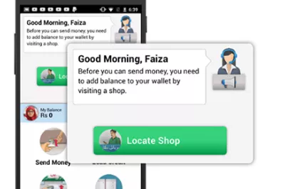
- Help users find agents
- Simplify application registration
- Flatten menu hierarchy
- Focus menu choices on actions
- Reduce text and use visual cues
- Design icons relevant to local users
- Use simple and familiar menu terms
- Build on users’ familiarity with smartphones
- Customize transaction choices
- Auto-fill from the address book and transaction history
- Auto-check to minimize human error
- Display information in digestible chunks
- Reassure with transaction confirmations
- Leave a clear trail of transaction histories
- Provide instructions when needed
- Handle errors by providing next-step solutions
- Customize and simplify keyboards
- Auto-calculate fees during transactions
- Provide full transaction details on one screen to finalize transactions
- Make account balance easy to see and hide
These are just the tip of the iceberg. There are many more ideas out there that need further testing.
- Can customers rate agents to enforce accountability?
- Should customers be able to self-register using the camera to capture their ID and facial images?
- Should visual images of cash notes be used to depict large values and leverage users familiarity and comfort with cash?
We need to push the boundaries to reach the truly disadvantaged, illiterate and those with disabilities. This first set of principles is just a starting point.


Add new comment