Swiping Right: Ideo.org Prototypes Mobile Money on Smartphones
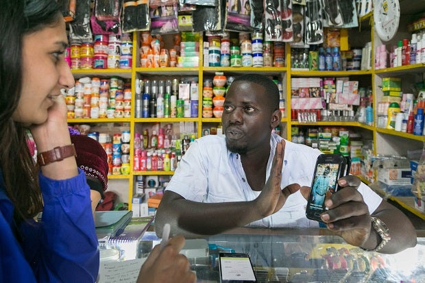
In IDEO.org’s financial health work around the world, we see customers and mobile-money agents alike struggle with the USSD interface for mobile money and limited functionality of basic and feature phones. We also see how common mistakes are in the mobile-money experience.
Ten to 12 digits in a phone number offer just enough room for input error. For example, you may discover you have sent a large sum of mobile money instantly, securely, and across a long distance – but to a stranger because the number was off by one digit. Or you may realize after the fact that you’ve sent 1 million shillings instead of the 10,000 shillings you intended, due to an extra zero or two that you accidentally pressed. A mistake that takes less than a second to make can lead to a week of lost wages, hours of time and travel required to resolve an issue at a customer-service center, and years of remembering how you were burned by mobile money.
What these cases indicate is a lack of support and safeguards in current phone interfaces. Sometimes our thumbs fail us, but our smartphones should not.
We believe new smartphone technology and human-centered interaction design of mobile-money apps can go a long way to solve problems and open up new doors, especially for low-income people. Here are a few stories from our financial health work in design-led prototyping that highlight challenges we have seen in our design and testing of digital financial services and unleash a few opportunities for design.
Barriers to input
Many people first learned to use mobile phones and other devices with physical buttons. Some users have become quite adept at common operations: In observations conducted in Tanzania this year, we saw many mobile-money agents fly through device menus and mobile-money tasks in seconds, not even looking at the screen at times. But touch interfaces change all that. Add to this a slew of unfamiliar apps that smartphones can present to a user, and the experience becomes quickly complex, if not overwhelming.
During prototype testing, we handed users a smartphone whose home screen was filled with the usual number of 9 to 12 app icons, and we showed mock-ups of apps with streamlined interfaces of four large buttons. Many turned to us with confused looks. One user simply asked us, “Get me to the screen with the numbers.” A keypad was the interface this user was most familiar with and wanted to revert to in the face of complexity. This reminds us of the learning curve for what we might otherwise think of as intuitive interfaces, and the need for both simpler app interfaces and education to onboard new users.
We tested a range of value propositions with mobile-money agents to understand for which uses and benefits they would choose to use smartphones over feature phones for mobile-money transactions. This informed our agent app design that is publicly shared on our Mobile Agents of Change microsite.
Wild gestures
In April, IDEO.org talked with a number of mobile-money agents in rural Uganda to test a smartphone agent-app prototype. We approached one agent and asked if she had used a smartphone before. She said yes, but it quickly became clear she wasn’t comfortable actually using one. When we placed the interactive prototype in her hands, her fingers kept accidentally brushing against the back button on the Android touch screen, and she became confused about why the screen kept changing abruptly.
When invisible gestures replace on-screen buttons, each gesture must be learned and remembered, and different apps may behave in different ways. Not only do they require fine motor control, but small differences matter. Case in point: swipe left instead of right and you end up with highly undesirable results in a social-dating app like Tinder.
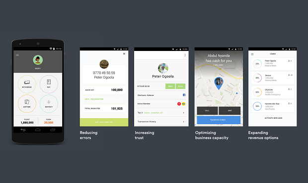
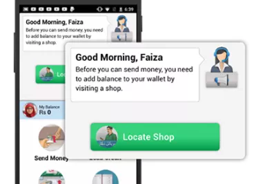
Our experiences in Uganda informed the design of a mobile-money agent smartphone-app that tries to solve some of the biggest problems in mobile money UX, including transparency, error handling, responsive tech support, and even fraud detection. In the design of the interface, we placed a premium on simplicity, streamlining how people are asked to input data and interact with the screen. We maximized clarity with screens that offer a single focus area for interaction and visual confirmation screens that use vivid color backgrounds to indicate state changes. And we held off on using touch-based gestures such as swipes. You can see IDEO.org’s mobile-money agent app design here.
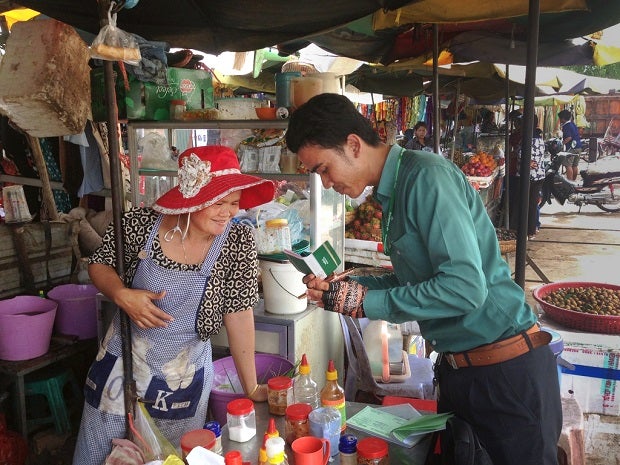
In Cambodia, we observed the use of existing smartphone apps and were struck by relatively minor UX elements that taken together led to lower productivity, frustration, and more work for users. This Amret mobile teller had to enter a login name and password each time he interacted with his 50 customers every day.
Problems with PINs
In digital finance, we understand how big a problem it has become to balance security with accessibility. People forget passwords and PINs, and we have seen this become a major problem for financial inclusion when people are unable to access hard-earned money on their mobile wallet.
CGAP’s UI/UX smartphone principles propose enabling PIN resets by the user (or mobile-money agent), which we think is great. Here are two ways we can improve on this:
- Streamline the passcode, a relatively easy fix. In Cambodia, Amret Microfinance developed a smartphone app for its mobile tellers serving rural customers, but every time the app was accessed, it required the user to re-enter a lengthy alphanumeric user login and password. We recommended they simplify this security feature to a single four-digit numeric PIN. For Amret’s mobile tellers who accessed the device 40 to 50 times a day, we estimated that this simple UI change could save 22 minutes, giving their staff enough time for lunch, or more customer transactions.
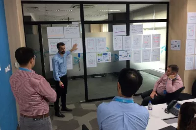
- Leverage biometrics. We are beginning to see passcodes and PINs replaced by hardware-enabled biometric scans like the Apple iPhone’s TouchID. IDEO.org challenged mobile network operators to “redesign the wallet at human-centered design workshops this spring.” Nearly every team featured a biometric scan of some sort in their designs, suggesting how prevalent a problem security and access are and how new forms of technology can help solve this. Some providers are demonstrating "selfie pay" features, but we haven’t seen these features reaching low-income customers yet.
Inspired by People
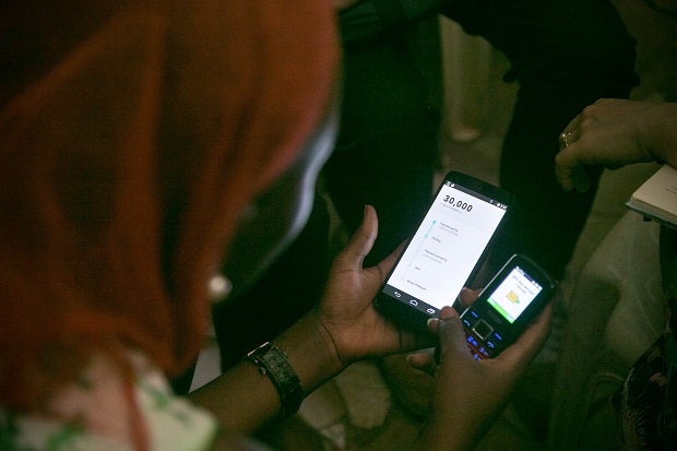
In our work in mobile money, we’re continually inspired by the people we meet who are using smartphones in unexpected ways and making technology work for them. While working with Econet in Zimbabwe, we met a smallholder farmer savings group who shared a smartphone to exchange information with other farmers in the country using WhatsApp. In Uganda, we met a mother whose child needed emergency hospital care, so she asked family and friends for help on a WhatsApp group; she quickly received informal loans and donations over mobile money.
As human-centered designers, we are inspired by these uses, hacks, and workarounds by people to develop new solutions. We are excited to help build smartphone experiences around people's needs, behaviors, and desires, and we believe this can go a long way to solve persistent problems and open up new doors for low-income people to access and use digital financial services.


Add new comment